Devlog week 06 - Testing
Week 06 - Testing
During testing session, the feedback was collected on various aspects such as :
- general feedback to find out about player's experience with the game, overall game rating, bugs, stability, and improvement suggestion.
- game control and difficulty to find out player's opinion about the game control and difficulty level.
- game art and visual appeal to find out player's opinion in relation to the art style and suitability.
- game background music and sound effect to find out player's opinion in relation to the suitability of those aspects.
And the summary of feedback on those aspects are:
1. General feedback:
They think the game is fun, having good concept and art. While the testers wished there was 1P mode (Player vs Computer mode) to add re-playability to the game, and there was no need to hover over the characters to throw the weapon (since it was 2P mode but only being played by 1 person). Those suggestion was actually part of the plan to make an option of 1P and 2P mode, however at the time of testing only 2P mode was available and 1P mode would be made if time allowed. By having multiple suggestion of having 1P mode, I made it into next priority for things had to be done and finally being implemented. Another suggestion was to have aiming projection line and power-up as part for game features, which I implemented once the 1P mode was done. Those great feedbacks made me pushed myself to aim to add more features instead of happy with the state of the game at that time, which was already finished (in term of start screen, game itself, end screen which can loop back to start screen or replay the game). One feedback that reminded me about game inclusivity was my how-to-play instruction was in red colour, which probably isn't a problem for me or most people, however one of tester has colourblind (deutan/green-red type) condition, which make it hard to read. The suggestion was to add shadow or outline effect which would help them to read easier. I implemented the outline for the title screen, and decided to change the colour of the how-to-play instruction.
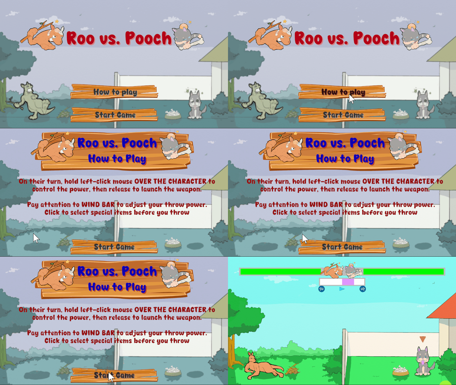
Previous game title and how-to-play instruction in red colour.
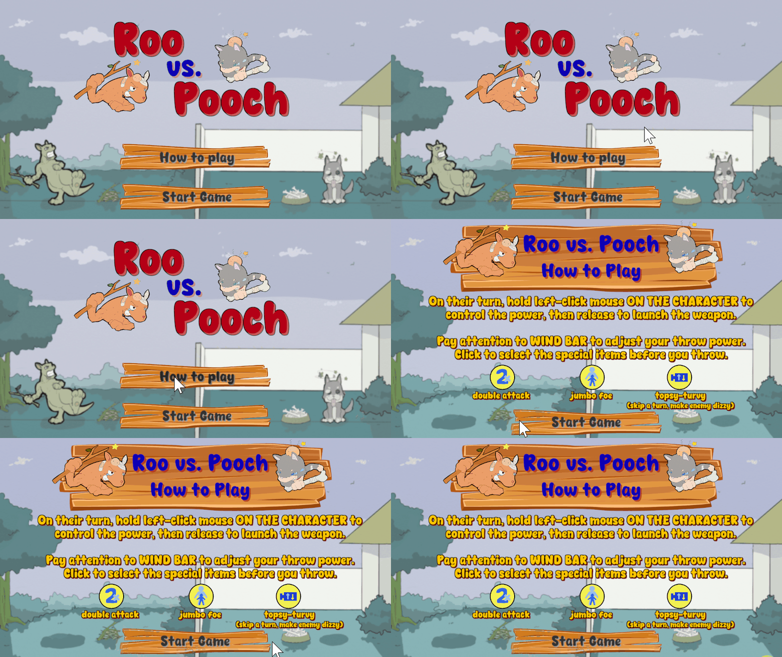
Updated game title with black outline, and how-to-play instruction colour changed into yellow with outline and shadow.
According to the feedback and observation, the game itself is pretty stable with no lags. And in terms of bugs, most of them notice that while there was a direct hit to the opponent, somehow the opponent didn't get hurt nor reduced the opponent's health. Another thing was the animation got stuck in certain position and didn't want to come back to standby state (it was only happened to 1 tester and myself) even though the game itself still could continue as normal. With the weapon didn't trigger to hurt the opponent and reduce the health bar, I refined again the collider for each character to minimize the bug from happening again in the future. And for the animation problem, I checked to ensure there is no exit time and transition duration between the animation state, however it was harder to be checked since it was never happened in the Unity and only happened in itch.io and only one time during my gazillion trials and errors.
2. Game control and difficulty:
Most of testers think the game control is easy enough to understand and all of them found the game control was smooth enough to play with. However, they think the game difficulty level is moderate tend to be too easy. Especially when they were playing against themselves in 2P mode. Those feedback encourage me to have different level of difficulty as well as power-ups to add challenge to the game. For the power-ups and hard level 1P mode, I sticked with my plan during game concept and made it into realisation.
Variation of 1P mode as shown in gif images below:
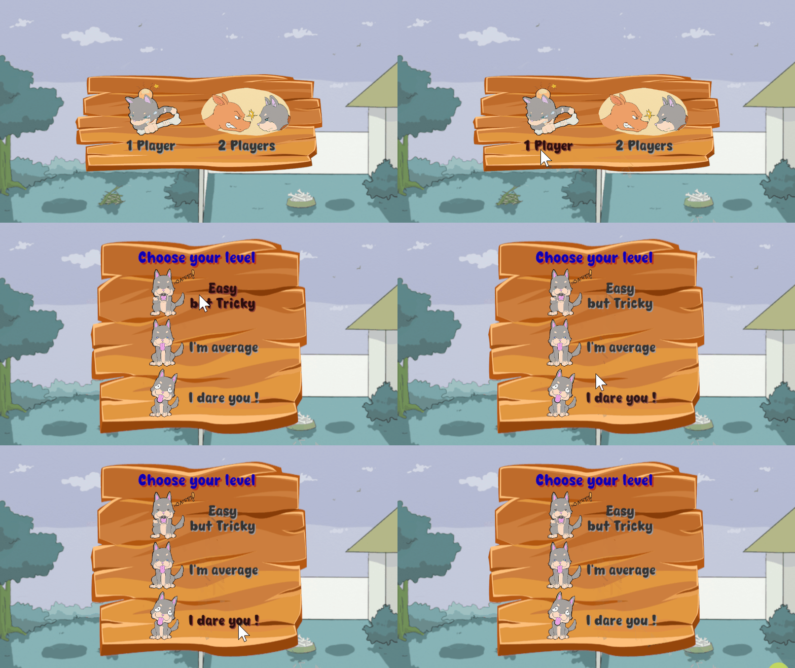
1P mode with 3 level of difficulties to choose.
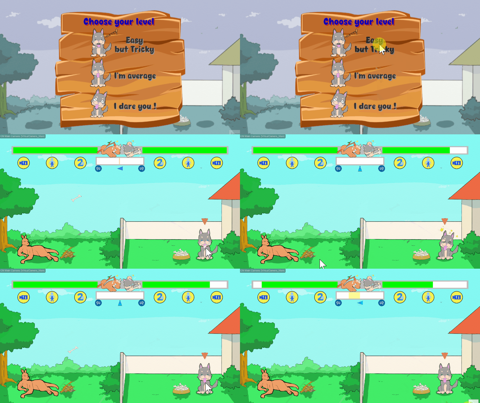
"Easy but tricky" level in 1P mode that comes with aiming projection line (some trickiness with the aiming projection line to make it not too easy - player needs to learn the pattern on how to use the aiming line as guidance in order to aim precisely).

"I am average" level in 1P mode doesn't have aiming projection line to help the player.

"I dare you!" level in 1P mode has an earthquake effect, which will add challenge to the player.
Power-up features in the game:
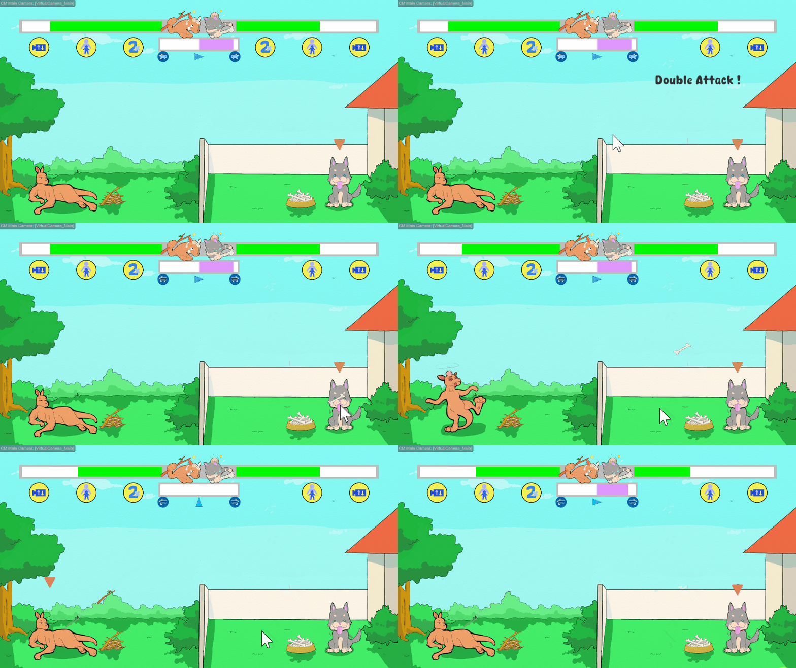
Double attacks power-up will resulting twice amount of damage if the weapon hit the opponent.
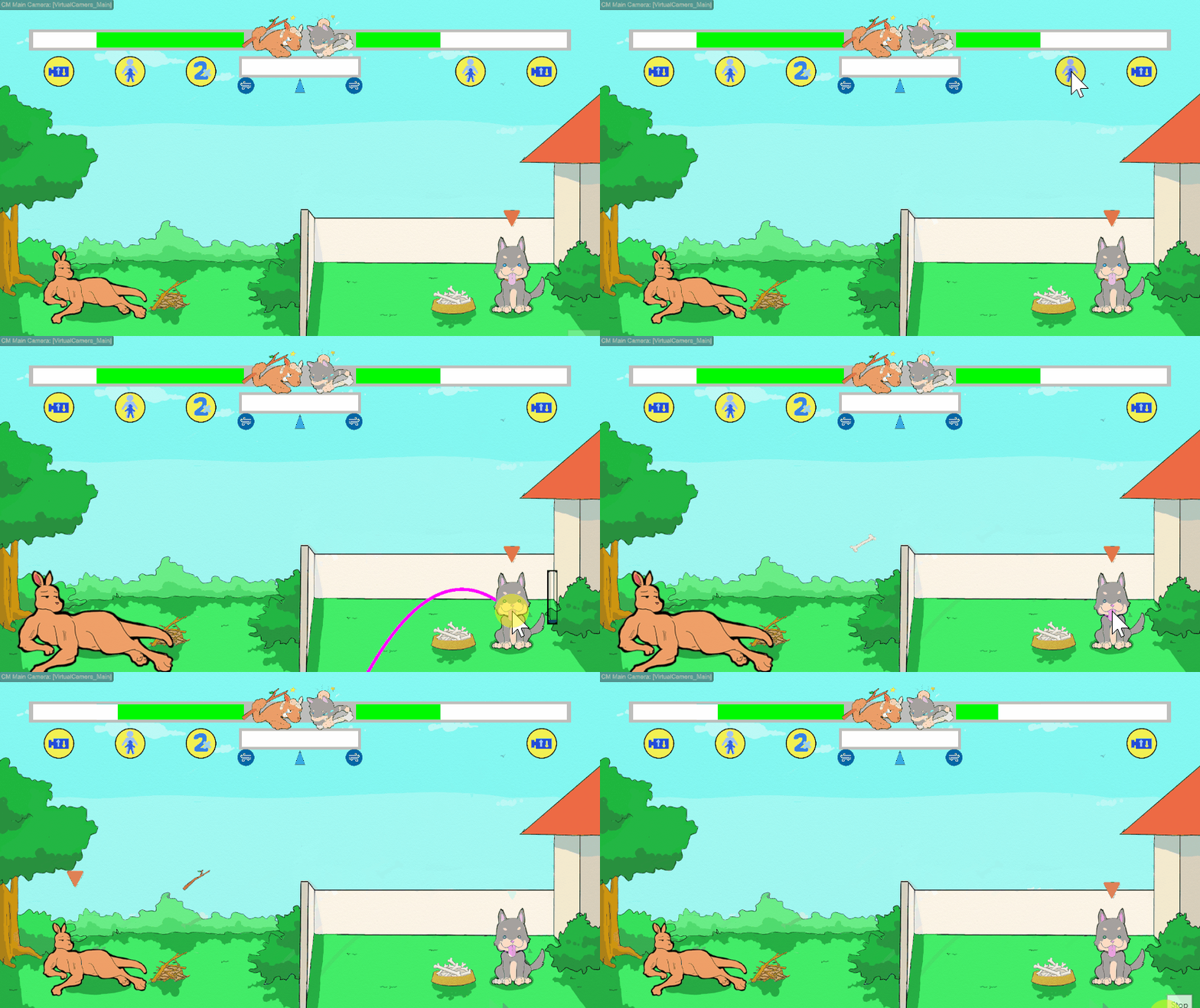
Jumbo foe power-up will make opponent bigger for limited amount of time, so it is easier for the weapon to hit the opponent.
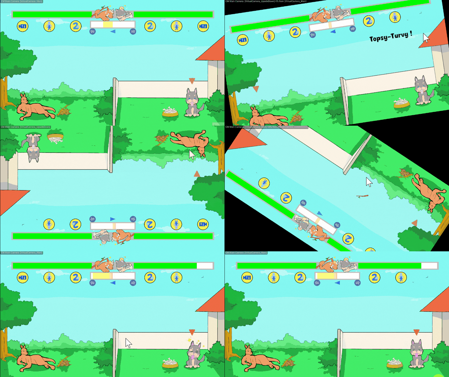
Topsy-turvy power-up will make player skip a turn, and it becomes your opponent's turn. However, your opponent and your view will be turned upside down and it will make them confuse while launch the attack. After that, upon your turn the view will be back to normal (unless your opponent use topsy-turvy as well, then it will be like Uno reverse effect).
3. Game art and visual appeal:
All of them think the art style suit the game and consistent throughout the game. The animations are great, and all of the screen art (title screen, how to play screen, and end game screen) look appropriate. Since everyone gave a good rating for the art and visual appeal, therefore there is no change being made into the game art.
4. Game background music and sound effect:
Everyone thought all of the background music are suitable for each screen/condition, with most of them thought the sound effects suit the game and lift the game a lot. There was a suggestion to choose sound effect that sounds like something hit an animal. However, due to limitation of time and exaggeration purpose of the sound effect, I decided to keep all the background music and sound effects as it is.
Files
Roo vs Pooch
More posts
- Documentation + User GuideOct 23, 2024
- Devlog week 05 - Polish and UIOct 20, 2024
- Game TestingOct 17, 2024
- Devlog week 04 - Presentation / GraphicsOct 13, 2024
- Devlog week 03 - Player DamageOct 06, 2024
- Devlog week 02 - Wind condition and Visual RepresentationsSep 29, 2024
- Devlog week 01 - Player's Weapon MovementSep 22, 2024
- Game ConceptSep 12, 2024
Leave a comment
Log in with itch.io to leave a comment.